'Never Not Working'

Founded by Mark Graham in 2003, ilovedust began as a small company in Southsea, England. They create fresh, innovative designs which make up for they're breath-taking, award-winning portfolio. They're work includes typography, illustration, branding, packaging, murals, animation and apparel designs. Throughout the 12 successful years of creating illustrations and graphic designs, ilovedust have grown to become a hugely successful company collaborating with brands far and near, including - RedBull, Nike, Coca Cola, wired, MTV, Virgin Media, Absolut Vodka, Empire Magazine and many more. Detail, craft and strong narrative are what piece together ilovedust' diverse portfolio. The 22 strong team are 'passionate by their craft' and love what they do, anticipating whats to come in the future.


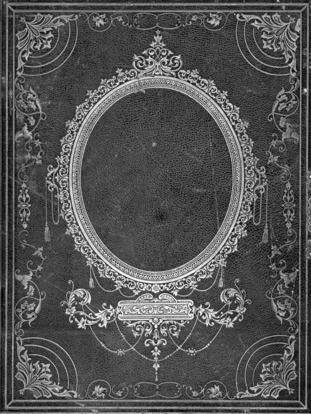
Although no imagery, there is a heavily detailed illustrated border around and throughout the book, which once again looks as though it is very much western, rock n roll inspired - it also looks like it has an element of ancient religion/church design put into the artwork which makes it very intriguing and cryptic like. Like previously said the design has elements of creativity in every corner you look into all due to the extremely intricate design work - with it ancient and old look it makes the book look like it is important and holds importat contents inside. When looking at the book I was personally first drawn into the title of the cover which is successfully done by the bold writing and intriguing fonts. After taking time looking at the title, you are almost immediatley attracted to the beautiful border giving you a chance to take in all of the book fine detail. The hierarchy of the book covers information is placed exactly right, your eyes being attracted to the main subject of the book then aloud to wonder and take in the rest of the design shows that this piece successfully fulfills the wants of the client.

Videos & Interviews
what made you want to become a designer / illustrator?
mark graham: in terms of being a designer/illustrator I’m not so sure it was an idea as such but rather that I just found myself going that way in terms of direction and interests. skateboarding to me played an absolute massive part in shaping that – even to this day, it’s the ‘thing’ which has made the biggest impact on me and my work. I was always inspired by people like mark gonzales, ed templeton, jason lee, people that mixed skating with more design based approaches in terms of their board graphics and the companies that they helped set-up. skating is just a big greasy melting pot of ideas and styles, personalities and values that you can’t help but be inspired by it and want to go out there and make your own mark too.
what do you think your strongest skill is?
MG: personally I think my strongest skill is knowing that there is a huge amount of people out there who can do things a lot better than me, and those are the people I want to work with and collaborate with. as a company I would say our biggest skill as a studio is being able to keep a cool head whilst all those around us are losing theirs and deliver a quality of work that makes everyone involved very proud.
in such a competitive industry how do you try to ensure you’re always in demand?
MG: by keeping young blood pumping through the veins of the company. ‘make the best of it, improvise, adapt to the environment, darwin, shit happens, I ching, whatever man we gotta roll with it’ – tom cruise in collateral
They're Work:
The piece above, made for BSSP was made by ilovedust to be put as the cover of they're Kiss Kama Sutra book. The heavily embellished illustration uses embossing and debossing to create this magnificent piece to be put on the final book cover. In terms of colour, despite the fact that this piece of work is only dark colours, mainly black and deep grey, the work does not fail to stand out. The limited colour pallete is what makes the piece so intriguing to look at because no matter where you look, left, right and centre detail can be seen and it gives it a certain depth and 'mysterious' look - this all helped by the embossing and debossing, of course.
The typeface, centred right in the middle has a range of different fonts which work well together and make a beautiful centre piece to the design. When first looking at the artwork, your eyes are immediately directed toward 'KISS' the typeface, I believe this links to the popular metal band 'Kiss' - gives off a very rock n' roll vibe which I believe is what the designers where aiming for and also reflects the theme of the book very well - it's also great that this is what you are first drawn into as this is the beginning of the title of the book. Below the words 'Kama Sutra' stand out with a western, cowboy vibe and once again holds a touch of rock n roll. The scale of all the fonts work well as they lead from small, to bold and large, to long, tall and striking. Your eyes follow the name of the book in the way supposed to. Once again the typeface although black stands out extremely well, with the embossing and debossing making it shine in certain light or if looked at in a certain way I feel this makes the book different and unique to most.
 |
| An ancient bible |
I feel as though this piece of work was most likely to of been created on the computer using design software such as Adobe Illustrator. Beforehand some of the design ideas may of been drafted by hand but after that I feel as though to make the work design so detailed and specific it would of had to be done using software. To create the embossing and debossing the piece would of had the been printed from a computer using a special printer to create this effect.
Despite just a small piece of work, I feel this piece is holds so much detail and creativity that it successfully attract people towards it immediately. The different texture, the embossing and the use of just on colour is what makes this piece so noticeable and absorbing.
"we are always evolving, we are always changing and our direction is still unknown if I’m entirely honest. we just want to turn up to work and enjoy what we are doing – that’s our first objective.'' - Mark Graham, creative director of ilovedust
"we are always evolving, we are always changing and our direction is still unknown if I’m entirely honest. we just want to turn up to work and enjoy what we are doing – that’s our first objective.'' - Mark Graham, creative director of ilovedust
More ilovedust Artwork -
 |
| Tiempo 94 Football Book Patches for Nike |
 |
| 'Seven Deadly Sins' - Scientific American magazine |
 |
| T Shirt collection - karl lagerfield x ilovedust |
 |
| '#theworldislistening' - The Grammys |
 |
| 'Mural' - Nike US Open of Surf |
 |
| 'Welcome To The Jungle' |
Videos & Interviews
what made you want to become a designer / illustrator?
mark graham: in terms of being a designer/illustrator I’m not so sure it was an idea as such but rather that I just found myself going that way in terms of direction and interests. skateboarding to me played an absolute massive part in shaping that – even to this day, it’s the ‘thing’ which has made the biggest impact on me and my work. I was always inspired by people like mark gonzales, ed templeton, jason lee, people that mixed skating with more design based approaches in terms of their board graphics and the companies that they helped set-up. skating is just a big greasy melting pot of ideas and styles, personalities and values that you can’t help but be inspired by it and want to go out there and make your own mark too.
what do you think your strongest skill is?
MG: personally I think my strongest skill is knowing that there is a huge amount of people out there who can do things a lot better than me, and those are the people I want to work with and collaborate with. as a company I would say our biggest skill as a studio is being able to keep a cool head whilst all those around us are losing theirs and deliver a quality of work that makes everyone involved very proud.
in such a competitive industry how do you try to ensure you’re always in demand?
MG: by keeping young blood pumping through the veins of the company. ‘make the best of it, improvise, adapt to the environment, darwin, shit happens, I ching, whatever man we gotta roll with it’ – tom cruise in collateral